Zoo New York: A New York State of Experience
Case Study: Zoo New York
Note: This blog is “From the Vaults.” Despite being posted in 2022, Felis Consulting’s visit occurred in summer of 2019. Many comments and impressions may be out of date.
If you are looking for an example of a small zoo who understands their mission and translates that into a cohesive brand and experience, look no further than the unaccredited 30+ acre Zoo New York (aka New York State Zoo at Thompson Park) in Watertown, New York.
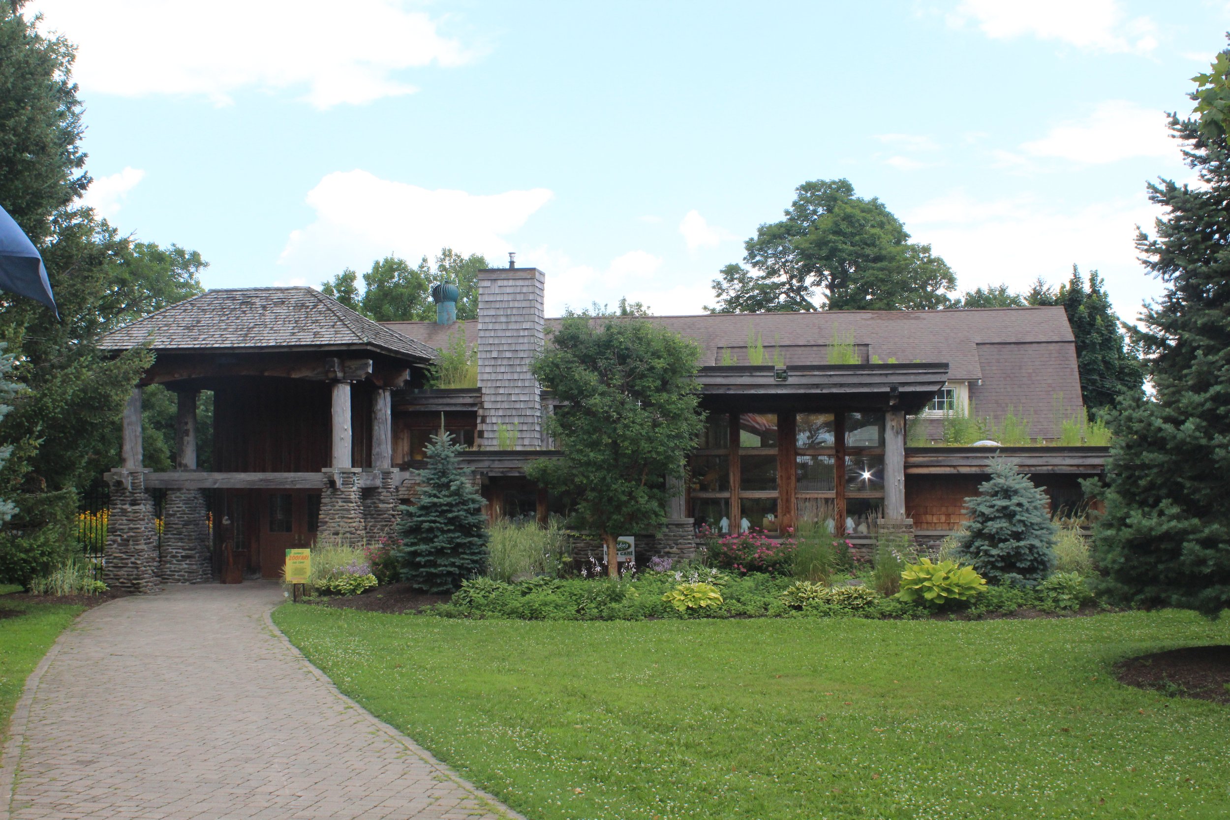
Beautiful, if understated, entry from parking lot.
The marketing description on their website had me thinking, “Yes, yes, yes.” In fact, so much yes, that instead of me trying to come up with something new and creative, I’ve just lifted it verbatim:
“Before the dawn of modern America, massive bison and elk wandered the land now known as New York State, while lynx prowled in dense forests and giant eagles soared through the sky. Though that landscape and its inhabitants have drastically changed, many of these animals can still be found in one place: the New York State Zoo at Thompson Park.
Spanning 32 acres, the zoo is home to a variety of species native to the Empire State. Some, like black bears and turtles, live in abundance in the wild; while others like the Canada lynx have earned an endangered or threatened status, making conservation efforts essential for their continued survival.
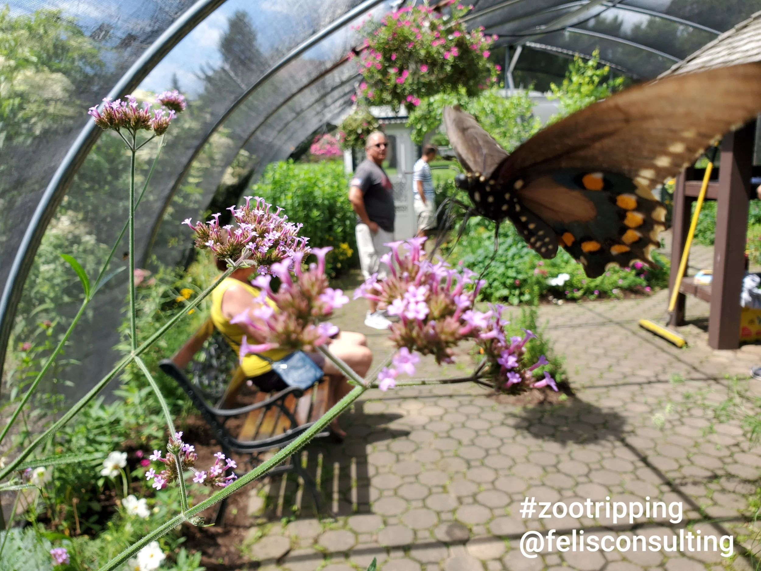
Beyond the ecosystems built around these animals, wildflowers skirt Olmsted Pond, and fluttering specimens fill the Butterfly House. A trail system is designed to carry you through modern rural landscapes while pointing out unique bird and plant species.”
This is a brand identity and experience statement if I’ve ever seen one.
And guess what, the zoo lives up to it.
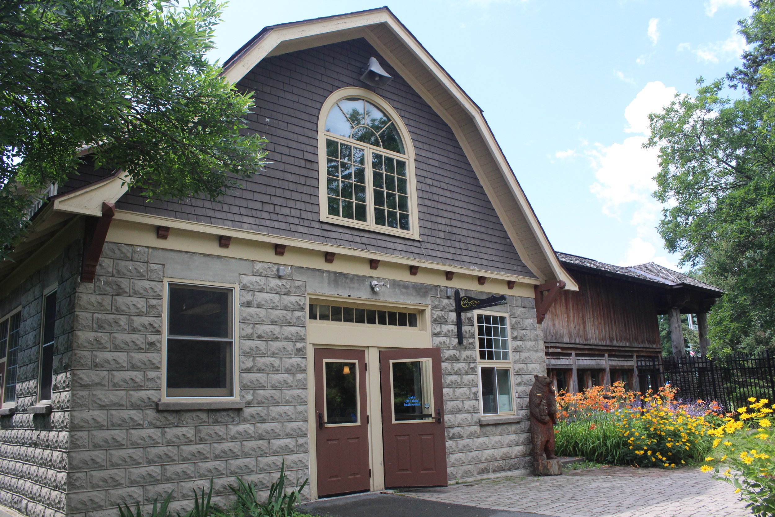
Buried deep in a city park, much like many small zoos, with a clearly undersized parking lot (I visited on a weekday at noon and every single space was taken), the entry is multi-layered, with a low-key sign and overhead banner marking your way from the parking into a beautiful, formal landscape anchored by an iconic and absolutely stunning entry building. The building, with a blend of Prairie and Adirondack style, features stonework and gables alongside flat green roofs. A visually striking representation of what we’ll see inside the zoo—a representation of upstate New York along with a keen eye toward conservation.
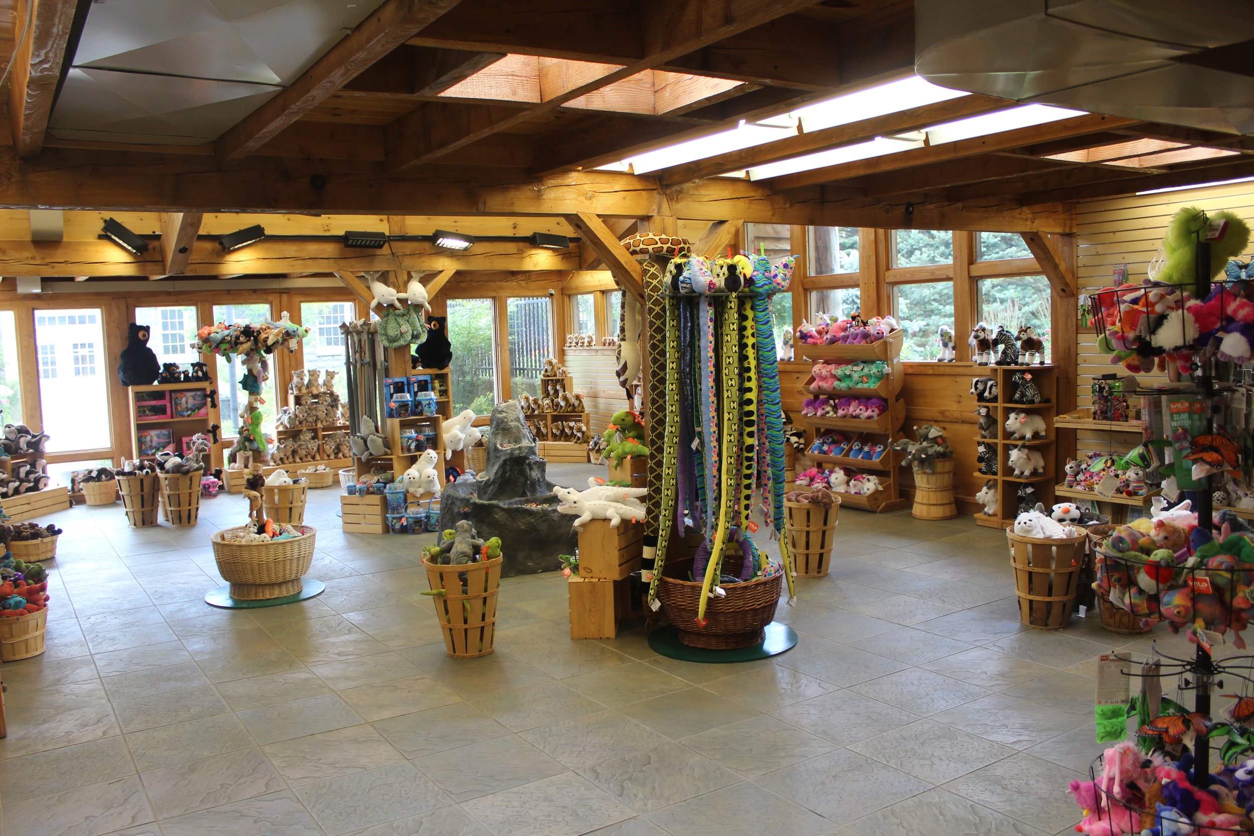
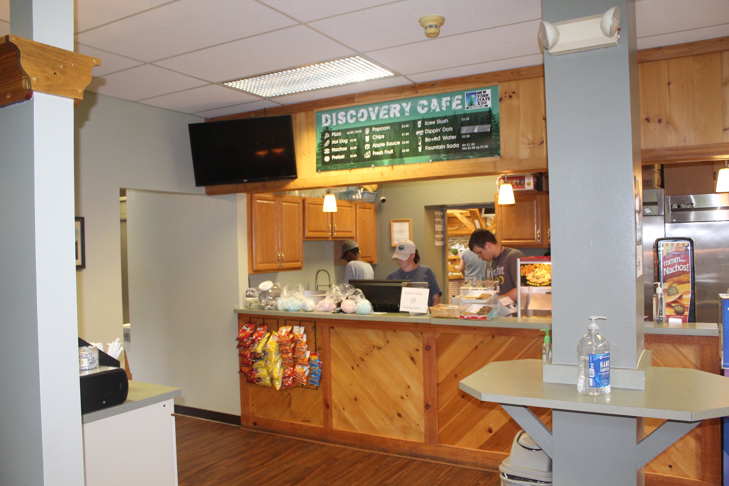
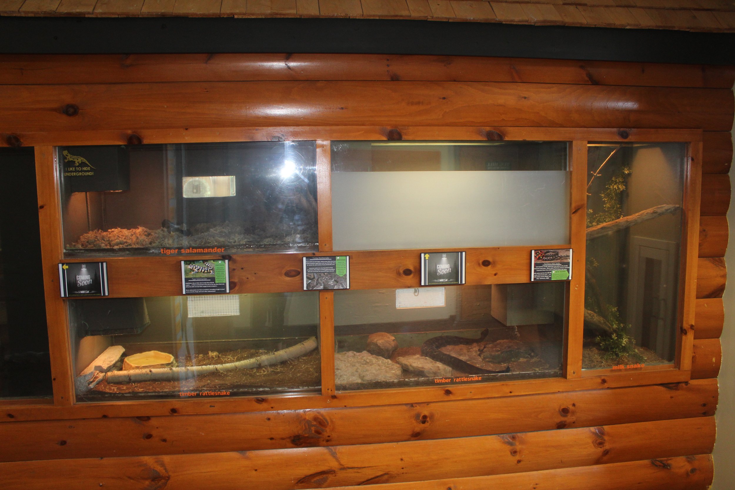
Inside the building, the flow doesn’t work quite well, and as a first-timer, I was confused as to where to begin exploring the zoo. But, the interior does have some efficiency with the ticket area backing to a very underwhelming snack area, and the gift shop stands adjacent to ticketing allowing a small staff to man the gift shop, take tickets, and provide snacks—at least on slow days. The building also features some awkward indoor seating alongside reptile exhibits, which I always love in entry buildings.
Once outside the entry building (there are four doors from the entry building sending you in different directions into the zoo), guests are immediately immersed in a state park setting. Pathways are enveloped in landscaping and woods. Initial exhibits are located fairly close to the entry building, and the further you get ‘lost in the woods,’ the exhibits become more and more spaced out—building that feeling of really getting into the forest.
Like every zoo, there is plenty of room for improvement. The habitats, while for the most part, large and naturalistic, feel pretty tired, and many could use some tweaking to improve viewing. The wolf habitat is one of the largest I’ve seen in any sized zoo, but only one formal viewing area is clearly demarcated, and guests are able to walk all the way around it with views pretty much the entire way. On the opposite extreme, the wolverine habitat, which is one I was very excited to see due to their rarity in zoos, was overgrown and had way too many hiding spots for the reclusive species. Much like me, many guests appeared frustrated to not locate the animal after intensive searching!
The river otter habitat appeared to have been a large investment for the zoo, but felt out of place with the much more naturalistic habitats throughout the zoo. It featured heavy fabricated rockwork, and all of the water was placed at the front of the exhibit—which was the only viewing. Inversely, all of the dry rest was located in the background, and if, like on the day I visited, the otters were curled up snoozing somewhere, they were totally invisible.
Other details could be improved like updating hand railings to a consistent look and character—especially since the entire zoo is within one thematic storyline. Some pathways were confusing as most were asphalt and consistent width—making it nearly impossible to determine if you were walking down a service road or a visitor path.
Highlights include the black bear exhibit, although fairly simple in design, utilized a wonderfully placed hillside to block views of the entirety of the exhibit—allowing bears to separate visually, and also providing an impression that the habitat was unending (it is, in fact, quite large). The inclusion of the history of the zoo site was also very compelling, with an explanation of the Olmsted pond and the abandoned root cellar.
Overall, Zoo New York is on the right track. In order to truly elevate the zoo to a benchmark institution, the Zoo will need to invigorate revenues for re-investment in improvements. A clear opportunity would be redesigning the snack stand, and perhaps an additional ‘grab and go’ style cart at the halfway point in the zoo. Right now, the Zoo clearly understands its mission and has created a clear vision for translating that into a brand experience. I suspect this little zoo will be making big waves in the years to come.
FYI: Since my visit, the zoo has rebranded from the New York State Zoo at Thompson Park to Zoo New York.
